Prepared by Kaweb
UX audit · V1

UX Audit
& Design Changes

Four UX design changes for partspakdirect.com, taken from a walkthrough of the live site. Every point below can be checked on the site today.

See the current site →
Client
PartsPak
Source
Live site, 2 Oct 2026
Scope
Homepage, listing, product page, quote flow, sign in, register
Prepared
Oct 2026
The audit

What we found

High priority

Asking for a price takes 6 steps and an account

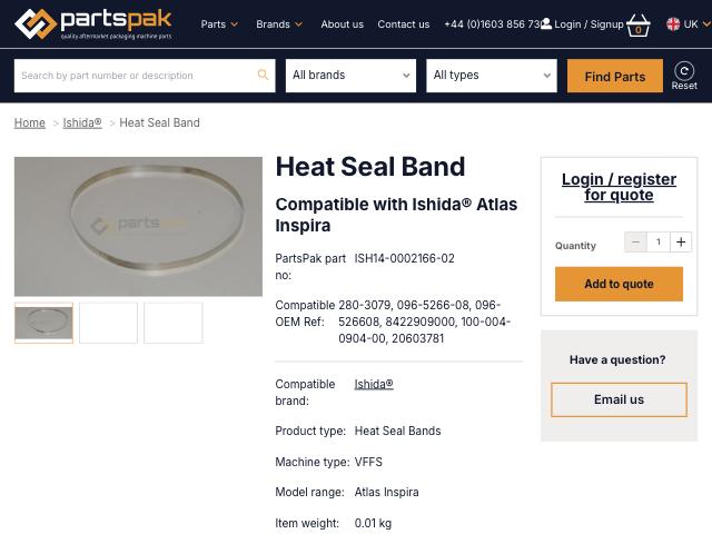
  • The product box shows Login / register for quote above Add to quote
  • Add to quote spins for about 7 seconds, then says added to basket
  • The basket button says Checkout
  • Checkout opens on Please login to access this page
  • Register asks for country and email, then more steps
Fixed by UX Design Change 01
High priority

Signing up asks for up to 17 fields

  • The site's register code defines three sections: Your Login, Your details, Billing Address
  • 17 fields in total, with Country asked twice
  • No reason is given to create an account. The page just says Your Login
  • Password rule: 8 or more characters with a mix of upper & lower case letters, numbers & symbols and no spaces, typed twice
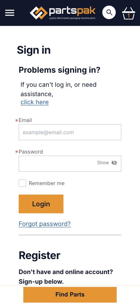
  • Sign in opens with Problems signing in? above the form
Fixed by UX Design Change 02
High priority

Nothing to compare before login

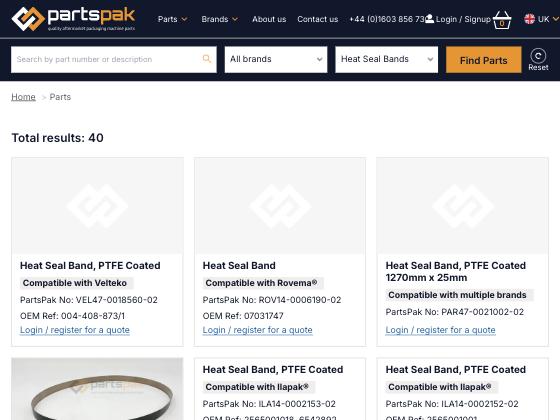
  • Heat Seal Bands: Total results: 40
  • All 16 cards on page one end in Login / register for a quote
  • No price, stock level or lead time on any card
  • The only trust line is in the footer: Quality first, Expert knowledge, On time delivery
Fixed by UX Design Change 03
Medium priority

The homepage headline is a picture

  • Quality aftermarket packaging machine parts is text inside a carousel image
  • The page has no H1 heading
  • Page title Home | PartsPak, meta description Home
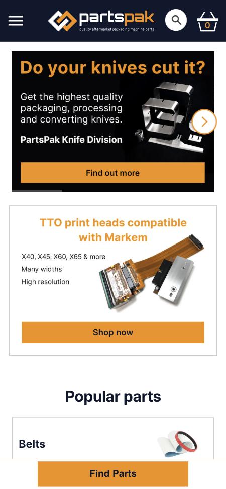
  • On mobile, the first screen is the carousel and a Markem promo. Search is an icon
Fixed by UX Design Change 04
UX Design Change 01Highest impact

Request a quote without an account

Product pageSee the current page ↗

The page today
Current product page. The right-hand box shows 'Login / register for quote' above an 'Add to quote' button.
?Background, reasoning and what improves

Background

Today a buyer goes Add to quote, basket, Checkout, login wall, Register, then further registration steps before a request is sent. That is 6 or more steps.

Why we are proposing this

The buyer has already found the part. Each step between finding it and asking for a price is a place to drop out. This change removes the account from that path.

Expected impact

  • 6+ steps down to 2
  • A first quote can be sent without signing up
  • No more lost quote baskets at the login wall
UX Design Change 02High impact

Sign up with email and password, details later

Sign in and registerSee the current page ↗

The pages today, mobile
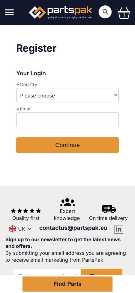
Current mobile sign in page. 'Problems signing in?' sits above the form; Register is below the fold behind the sticky Find Parts bar.Current mobile register page, step one: Country set to 'Please choose' and an Email field, then Continue.
?Background, reasoning and what improves

Background

Step one shows Country and Email. The field labels in the site's register code add Password, Confirm password, Title, First Name, Last Name, Job Title, Company Name, Telephone, Industry and a six line billing address. We did not create an account, so please confirm which of these show today.

Why we are proposing this

Every field before the first quote is a reason to stop. Asking for two fields now and the rest when there is a reason for it keeps the same data, just later. A short list of what the account gives them answers why they should bother.

Expected impact

  • Up to 17 fields down to 2 at sign up
  • One password field instead of two
  • Same data collected, just when it is needed
UX Design Change 03High impact

Show one buying signal before login

Heat Seal Bands listingSee the current page ↗

The page today
Current Heat Seal Bands listing. Cards show part numbers and OEM references, most with a placeholder image, each ending in 'Login / register for a quote'.
?Background, reasoning and what improves

Background

Cards show the part number, OEM reference and compatible brand, which is what engineers check. Nothing says whether it is in stock or how fast it ships.

Why we are proposing this

A buyer with a line down needs to know the part can arrive in time before asking for a price. One line answers that without showing the price.

Expected impact

  • Buyers can see if a part will arrive in time
  • Needs: which lead time or stock figure you can publish
UX Design Change 04Medium impact

Lead the homepage with a headline and search

HomepageSee the current page ↗

The page today, mobile
Current mobile homepage. The first screen shows a knife division carousel slide and a Markem print head promo; search is an icon in the header.
?Background, reasoning and what improves

Background

The headline is part of an image, the slides rotate between product lines, and on mobile the search box is hidden behind an icon.

Why we are proposing this

Most visitors come to find one part. A fixed headline tells new visitors what PartsPak is, and open search gets returning buyers to the part faster.

Expected impact

  • New visitors know what PartsPak sells at a glance
  • Search is one tap away on every device
  • Headline readable by Google and screen readers